Web accessibility, though frequently disregarded, offers universal advantages. This article examines a standard tile-based variant selector, initially developed following the path of least resistance, highlights its shortcomings, and demonstrates how to enhance its accessibility for all users.
Background
Building accessible experiences hinges on the proper use of semantic HTML elements. This might seem like a minor detail, especially since Angular’s event binding works with any HTML tag and CSS can be used to achieve the desired visual design. However, the importance of semantic HTML extends beyond these considerations.
<div class="primary-button" (click)="onClick()">Click me!</div>A clickable element built in this way presents several challenges:
- Negative impact on developer experience: It hinders code readability, making it difficult to quickly identify the purpose of the element.
- Bad for SEO: Your website’s search engine ranking suffers.
- Confusing navigation: Users relying on assistive technologies struggle to navigate the page due to a lack of precise element purpose.
- Lack of inherent interactivity: Unlike some HTML elements,
<div>doesn’t support interactive functionality.
While technically possible to force a div to behave as intended, the resulting code is often messy and inefficient:
<div
 class="primary-button"
 role="button"
 tabindex="0"
 style="cursor: pointer"
 (click)="onClick()"
 (keydown.space)="onClick(); $event.preventDefault()"
 (keydown.enter)="onClick()"
>
 Click me!
</div>
To replicate the behavior of a standard <button> element with a <div>, several modifications are necessary:
- Assign
role="button"to ensure assistive technologies recognize it as a button. - Set
tabindex="0"to enable keyboard focus via the TAB key. - Apply
cursor: pointerstyles, which are standard for buttons. - Beyond a click handler, implement a keydown handler for the Space and Enter keys, mirroring native button functionality.
- When handling the Space key, call
$event.preventDefault()to prevent the browser’s default scrolling behavior that occurs when the spacebar is pressed.
This extensive customization is not an ideal approach, especially if we consider the simplicity achieved otherwise:
<button class="primary-button" (click)="onClick()">Click me!</button>Why should I care about accessibility?
You might be asking yourself this question, and rightfully so. While most of us navigate the web easily with a mouse, some users cannot. The reasons for this vary, from difficulty using a mouse due to shaky hands to relying entirely on voice assistants, which programmatically invoke keyboard commands.
To grasp how keyboard-only interaction with the web works, consider the following code and play around with the rendered HTML:
<fieldset>
 <legend>Choose your favorite fruit</legend>
 <div>
   <label for="apple">Apple</label>
   <input type="radio" name="fruit" value="apple" id="apple" />
 </div>
 <!-- Rest of fieldset elements... -->
</fieldset>


<fieldset>
 <legend>Choose your favorite vegetable</legend>
 <div>
   <label for="carrot">Carrot</label>
   <input type="radio" name="vegetable" value="carrot" id="carrot" />
 </div>
 <!-- Rest of fieldset elements... -->
</fieldset>- Use Tab to navigate forward through focusable elements until you reach the first radio button in the „Choose your favorite fruit” group.
- Use the Arrow keys (Up/Down or Left/Right) to navigate between options within the same group.
- Press Tab again to move to the next focusable element (e.g., the „Choose your favorite vegetable” group).
- Use Shift + Tab to return to the „Choose your favorite fruit” group.
- Remember, only one radio button per group can be selected at a time.
These interactions are supported by all modern browsers, ensuring accessibility for keyboard users. It is vital to build components that are accessible to everyone, not just those who use a mouse.
Introducing the problem
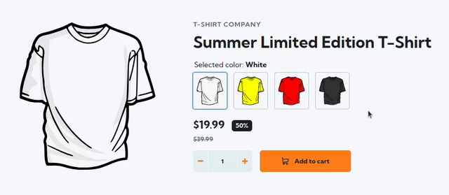
Now, let’s focus on the core of this article: building a tile-based selector for T-shirt variants. Keyboard navigation is essential, extending beyond typical mouse-click selection. The example above clearly demonstrates this point, as the cursor, placed next to the list of variants, indicates that mouse input is not used for variant selection. Achieving this requires appropriate HTML markup.
The bad approach
Many developers, when presented with a UI element such as a collection of tile-based images, instinctively envision it as a standard series of <img> elements, constructing a template that would resemble the following:
<div class="variant-selector__selected-color">
 Selected color: @if (activeVariant()?.name) {
 <strong>{{ activeVariant()!.name }}</strong>
 }
</div>
<div class="variant-selector__tiles-container">
 @for (variant of variants(); track variant.id) {
 <img
   class="variant-selector__image"
   [class.variant-selector__image--active]="variant.id === activeVariant()?.id"
   [ngSrc]="variant.thumbnailSrc"
   alt="{{ variant.name }} T-Shirt"
   width="74"
   height="80"
   (click)="variantSelected.emit(variant)"
 />
 }
</div>
While seemingly acceptable, this approach lacks keyboard support. This is because HTML image elements are not interactive by default, preventing them from being focused or navigated using a keyboard.
The solution
Looking at this from another angle, this example precisely reflects a standard HTML radio group: it’s a collection of controls where only one can be active at a time. With this in mind, let’s refine our original markup:
<fieldset role="radiogroup">
 <legend class="variant-selector__selected-color">
   Selected color: @if (activeVariant()?.name) {
   <strong>{{ activeVariant()!.name }}</strong>
   }
 </legend>
 <div class="variant-selector__tiles-container">
   @for (variant of variants(); track variant.id) {
   <label>
     <input
       [attr.aria-label]="variant?.name"
       class="cdk-visually-hidden"
       type="radio"
       name="variant"
       [value]="variant.id"
       [checked]="variant.id === activeVariant()?.id"
       (change)="variantSelected.emit(variant)"
     />
     <img
       class="variant-selector__image"
       [ngSrc]="variant.thumbnailSrc"
       alt="{{ variant.name }} T-Shirt"
       width="74"
       height="74"
     />
   </label>
   }
 </div>
</fieldset>
Key Changes Made
We modified our approach by replacing image tags with visually hidden <input type="radio"> elements. This was achieved by using the cdk-visually-hidden class provided by Angular CDK to hide the radio button circles while maintaining their focusability.
You might wonder, why not just use visibility: hidden or display: none? The key difference is that the cdk-visually-hidden class is designed to hide elements visually while still keeping them interactive and available to assistive technologies.
Consequently, users can now navigate and select variants using the keyboard, mirroring the functionality of standard radio groups discussed previously. If you’re using Tailwind CSS in your project, you could use the sr-only class instead, which serves the exact same purpose.
For better semantic grouping and accessible labeling, we incorporated <fieldset> and <legend> elements. To further support screen reader users, we added the aria-label attribute to the input fields. While sighted users can identify the tiles visually (e.g., a specific color t-shirt), users relying on assistive technology depend on spoken cues provided by screen readers. Attributes like aria-label make these cues meaningful and descriptive — for example by announcing „Yellow T-shirt„.
Summary
Accessibility is not merely an abstract concept relevant to a niche group of users; it offers universal benefits.
- Users with disabilities gain full access to the product.
- Developers benefit from an enhanced developer experience, working with code that is more testable and logical, primarily due to its foundation in native browser features.
- The company mitigates financial risks, enhances SEO and upholds high ethical standards.
For those interested in exploring the solution presented in this article, the code repository is available. You can review the commit history, starting from the initial „bad” approach, and then follow the steps detailed in the article.
Alternatively, if you prefer video content, I recommend my talk at the Angular Camp event, organized by angular.love. In this presentation, I not only live-code the transformation from the less accessible method to the improved one but also provide a comprehensive introduction to accessibility.